James Dales and I recently spoke at SQLBits about how geospatial analytics is transforming thanks to modern cloud-native formats. Our talk, "Geospatial Meets Big Data: Transforming Location Intelligence," provided insights into emerging technologies reshaping location analytics.
During our presentation, we demonstrated how DuckDB could be embedded within Power BI to unlock advanced geospatial capabilities. This blog expands on our SQLBits talk, offering a more detailed exploration and practical examples.
Introducing DuckDB: A Lightweight Powerhouse
DuckDB is an open-source, lightweight SQL database designed specifically for analytical workloads. Built for efficiency and ease of use, it runs directly within the host process with no need for a separate server, and can operate entirely in-memory or on disk as needed. Its columnar storage, vectorised execution, and minimal setup make it well-suited for modern, cloud-based analytics.
This lightweight and flexible architecture led us to explore DuckDB’s potential for enhancing geospatial data processing within Power Query, especially for scenarios where performance and portability are key.
Integrating DuckDB with Power Query
Our first step involved setting up the necessary drivers. We downloaded the DuckDB ODBC driver directly from their official site DuckDB ODBC Driver and installed it locally. While exploring connectivity options, we discovered MotherDuck's custom DuckDB connector for Power BI. Initially promising, we soon realised its limitations, it provided basic table access but lacked the ability to install the DuckDB geospatial libraries, executing custom SQL and required a physical instance of duck db on disk somewhere. Thus, we decided to handle connectivity manually using Power Query M scripts.
After a few minutes of tinkering, we achieved what we had hoped might be possible: spinning up a fully in-memory instance of DuckDB that lives entirely in RAM. This gives us all the power of DuckDB with zero files, zero server process, and zero install footprint. All that was needed was this simple one-line connection string:
ConnStr  = "Driver=DuckDB Driver;" &
           "Database=:memory:;" &
           "access_mode=read_write;" &
           "custom_user_agent=PowerBI;",
Direct Access to Overture Data with DuckDB
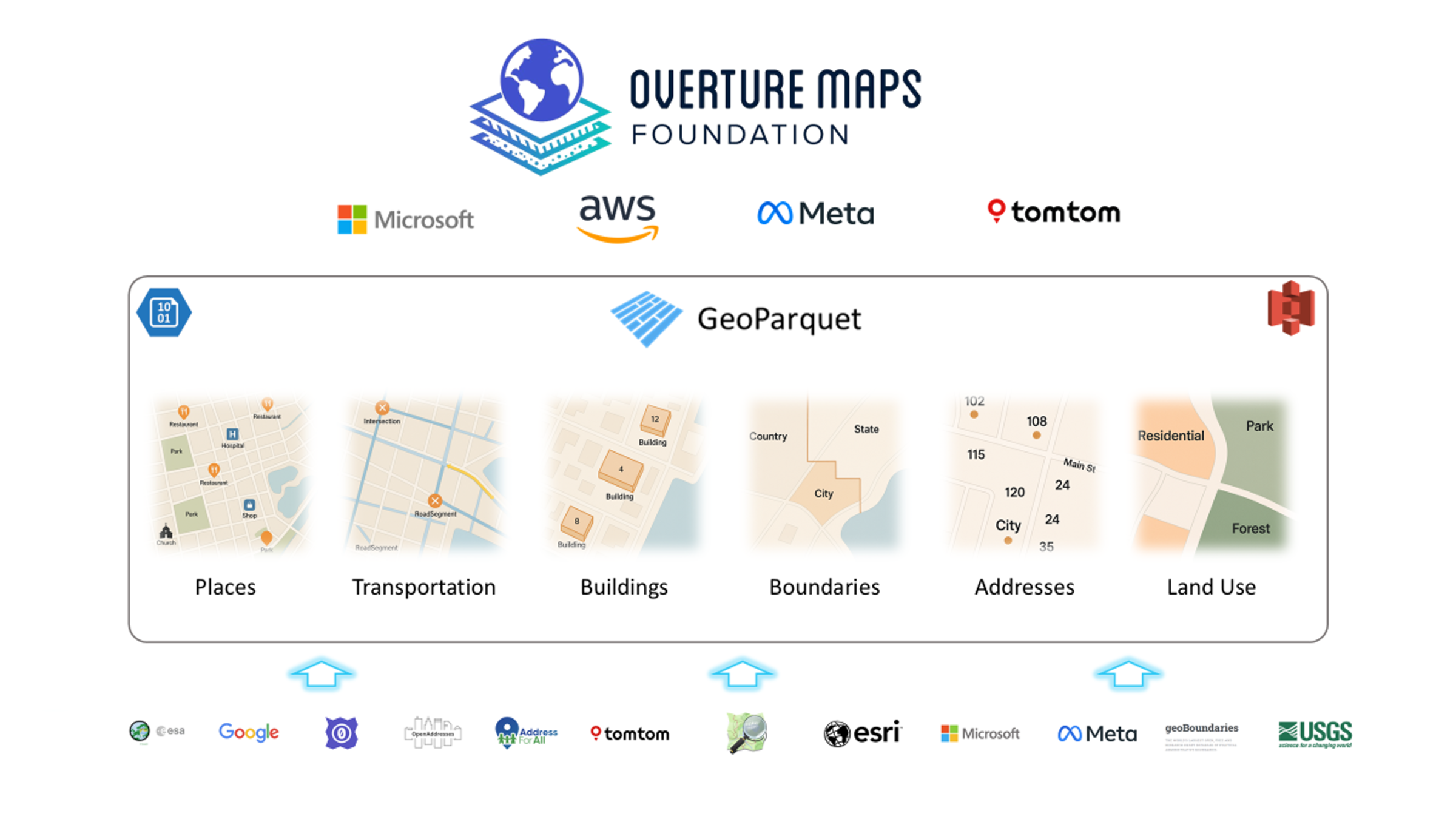
Our initial practical use case was to dive straight into Overture Maps, a community-driven, open-source basemap project created collaboratively by Amazon, Microsoft, Meta, and TomTom, and hosted under the governance of the Linux Foundation. Overture provides comprehensive global map data, including detailed administrative boundaries, building footprints, transportation networks, points of interest, and more. This data is made available through regular monthly releases, which users can access directly from cloud storage platforms such as AWS S3 and Azure Blob. The diagram below provides an overview of Overture Maps' datasets and structure.
To make things easier, we developed a reusable Power Query function that sets up the DuckDB connection, installs the required libraries (spatial and httpfs), and provides a SQL placeholder ready for use. This allows seamless execution of DuckDB SQL and direct access to data from AWS S3.
(Note: While there is a version of Overture Maps hosted in Azure, we found the S3 version worked immediately, so we chose to use that.)
Here’s the Power Query function:
//////////////////////////////////////////////////////////////////////
// DuckDBQuery  – execute arbitrary DuckDB SQL in an in-memory DB
// ---------------------------------------------------------------
// Parameters:
//   sqlText  (text, required)   – your SELECT / DDL / DML script
//   s3Region (text, optional)   – defaults to "us-west-2"
//
//////////////////////////////////////////////////////////////////////
let
    DuckDBQuery =
        (sqlText as text, optional s3Region as text) as table =>
        let
            // ── 1. choose region (default us-west-2) ──────────────────────
            region   = if s3Region = null then "us-west-2" else s3Region,

            // ── 2. one ODBC connection string to an in-memory DB ─────────
            ConnStr  = "Driver=DuckDB Driver;" &
                       "Database=:memory:;" &
                       "access_mode=read_write;" &
                       "custom_user_agent=PowerBI;",

            // ── 3. build a single SQL batch: install, load, set, run ─────
            BatchSQL =
                Text.Combine(
                    {
                        "INSTALL spatial;",
                        "INSTALL httpfs;",
                        "LOAD spatial;",
                        "LOAD httpfs;",
                        "SET autoinstall_known_extensions=1;",
                        "SET autoload_known_extensions=1;",
                        "SET s3_region = '" & region & "';",
                        sqlText
                    },
                    "#(lf)"                // line-feed separator
                ),

            // ── 4. execute and return the result table ───────────────────
            Result   = Odbc.Query(ConnStr, BatchSQL)
        in
            Result
in
    DuckDBQuery
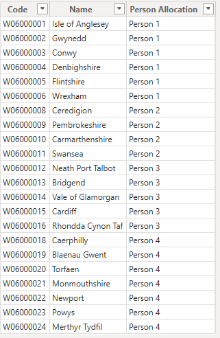
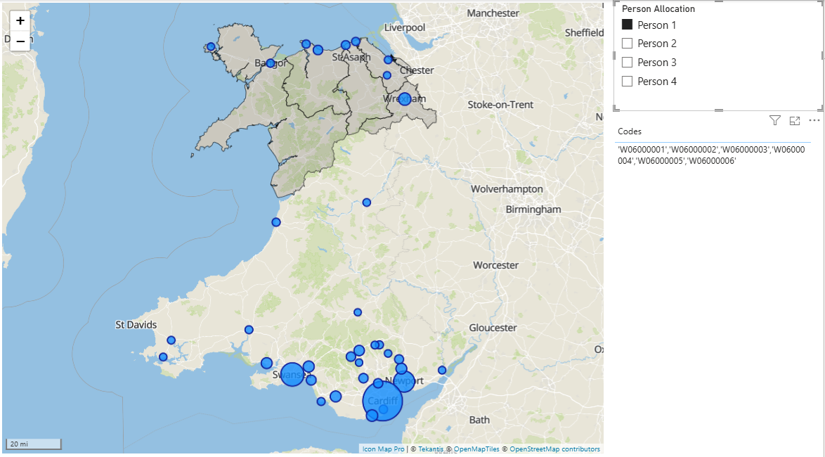
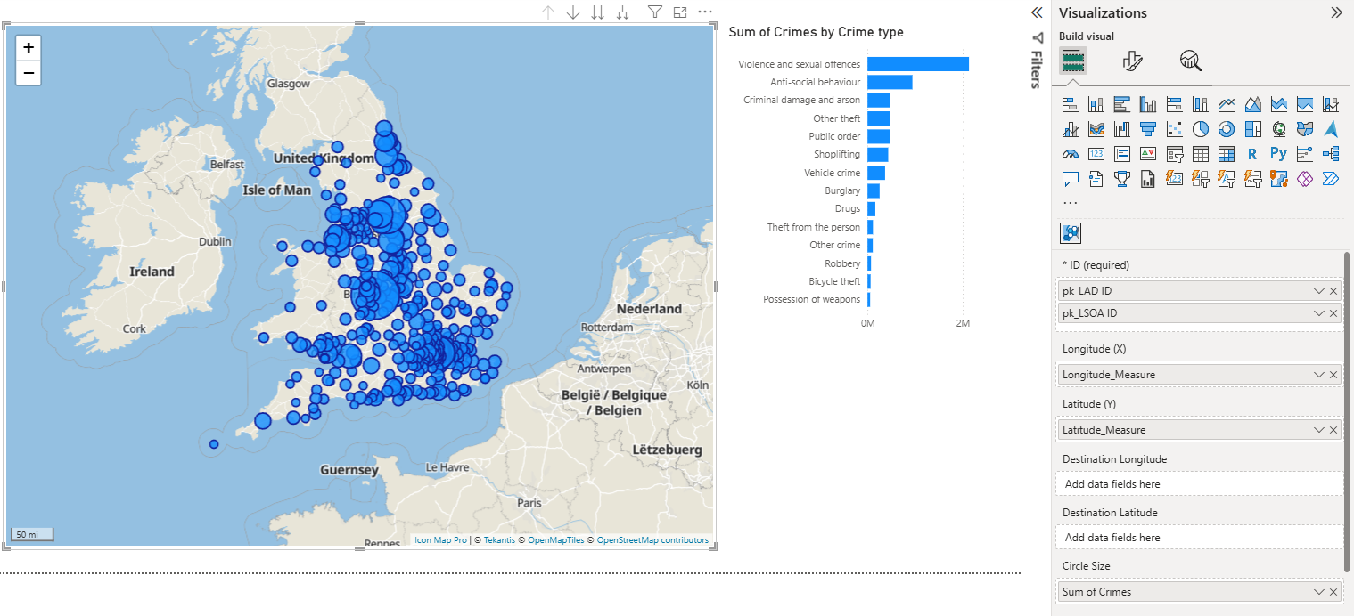
Using our custom function, we started by directly accessing the area boundaries from the Overture Divisions theme. Overture data is structured as a number of data themes. Each is stored as GeoParquet files in cloud storage, an enhanced version of the widely-used Apache Parquet format, which powers big data frameworks like Apache Spark and Trino. GeoParquet therfore blends geospatial processing capabilities with the high-performance analytics advantages of columnar data storage.
DuckDB is specifically optimised for this format and natively interacts with GeoParquet files directly in cloud environments using its built-in read_parquet function, thus enabling efficient spatial queries against massive datasets without additional data transformations or transfers.
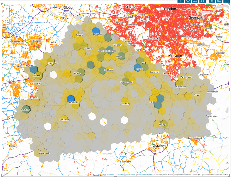
For our first example, we extracted county boundaries within Pennsylvania, USA. We also leveraged DuckDB's ST_AsText function to convert binary geometries (WKB) into readable WKT formats that are fully compatible with Power BI and Icon Map Pro.
let
    Source = #"DuckDB Overture SQL Script"("
        SELECT id,
               division_id,
               names.primary,
               ST_AsText(geometry) AS geometry_wkt
        FROM   read_parquet(
                   's3://overturemaps-us-west-2/release/2025-01-22.0/theme=divisions/type=division_area/*',
                   hive_partitioning = 1
               )
        WHERE  subtype = 'county'
          AND  country = 'US'
          AND  region  = 'US-PA';", null)
in
    Source
Here was the data returned:
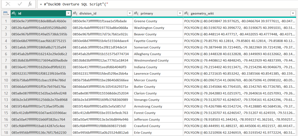
The query executed in around 25 seconds, retrieving all 67 counties. This doesn't sound that impressive but when you consider the dataset contains over 5.5 million divisions within a 6.4GB GeoParquet file, accessed remotely from AWS cloud storage it's not bad at all.
Addressing Column Truncation Issues
Initially, our geometry data was truncated to 200 characters due to metadata handling limitations between Power Query and the DuckDB ODBC driver. When the ODBC driver does not expose column length information, Power BI defaults to a maximum of 200 characters for string columns. To resolve this, we explicitly cast our geometry data to a wider column type.
CAST(ST_AsText(geometry) AS VARCHAR(30000))
This ensured the most geometry polygons were retrieved successfully but a few were still over the 30000 character limit.
Simplifying the Polygons
To get all polygons under the limit we needed to simplify the polygons, luckily DuckDB has another handy function ST_SimplifyPreserveTopology.
Also to simplify usability, especially for analysts unfamiliar with SQL, we extended our PowerQuery function, allowing users to query Overture themes, specify column selections, conditions, and simplify polygons directly via function parameters.
//////////////////////////////////////////////////////////////////////
// OvertureQuery – default boundary simplification //
//////////////////////////////////////////////////////////////////////
let
OvertureQuery =
(
theme as text, //Overture maps theme
ctype as text, //Overture Maps Dataset
optional columnsTxt as nullable text, //list of columns, defaults to all
optional includeGeomWkt as nullable logical, //include the geometry as WKT
optional whereTxt as nullable text, //the where clause to filter the data
optional s3Region as nullable text, //options s3 region, defaults to us-west-2
optional simplifyTolDeg as nullable number // degrees tolerance, default 0.0005, 0=none
) as table =>
let
// ── defaults ────────────────────────────────────��────────────
region = if s3Region = null then "us-west-2" else s3Region,
colsRaw = if columnsTxt = null or columnsTxt = "" then "*" else columnsTxt,
addWkt = if includeGeomWkt = null then true else includeGeomWkt,
tolDegDefault = 0.0005, // ≈ 55 m at the equator
tolDeg = if simplifyTolDeg = null then tolDegDefault else simplifyTolDeg,
// ── geometry expression ────────────────────────────────────
geomExpr = if tolDeg > 0
then "ST_SimplifyPreserveTopology(geometry, " &
Number.ToText(tolDeg, "0.############") & ")"
else "geometry",
// ── SELECT list ────────────────────────────────────────────
selectList = if addWkt
then Text.Combine(
{ colsRaw,
"CAST(ST_AsText(" & geomExpr & ") as VARCHAR(30000)) AS geometry_wkt" },
", ")
else colsRaw,
// ── WHERE clause (optional) ────────────────────────────────
whereClause = if whereTxt = null or Text.Trim(whereTxt) = ""
then ""
else "WHERE " & whereTxt,
// ── parquet URL ─────────────────────────────────────────────
parquetUrl =
"s3://overturemaps-" & region & "/" &
"release/2025-01-22.0/" &
"theme=" & theme & "/type=" & ctype & "/*",
// ── ODBC connection string (in-memory DuckDB) ──────────────
ConnStr =
"Driver=DuckDB Driver;" &
"Database=:memory:;" &
"access_mode=read_write;" &
"custom_user_agent=PowerBI;",
// ── SQL batch ───────────────────────────────────────────────
SqlBatch = Text.Combine(
{
"INSTALL spatial;",
"INSTALL httpfs;",
"LOAD spatial;",
"LOAD httpfs;",
"SET autoinstall_known_extensions = 1;",
"SET autoload_known_extensions = 1;",
"SET s3_region = '" & region & "';",
"",
"SELECT " & selectList,
"FROM read_parquet('" & parquetUrl & "', hive_partitioning = 1)",
whereClause & ";"
},
"#(lf)"
),
// ── run and return ──────────────────────────────────────────
OutTable = Odbc.Query(ConnStr, SqlBatch)
in
OutTable
in
OvertureQuery
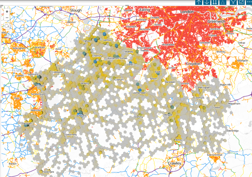
Now we could easily invoke queries without writing any SQL and also simplify the polygons:
Source = #"DuckDB Overture Query with Simplify"(
    "divisions",
    "division_area",
    "id, division_id, names.primary",
    true,
    "subtype = 'county' AND country = 'US' AND region = 'US-PA'",
    null,
    null)
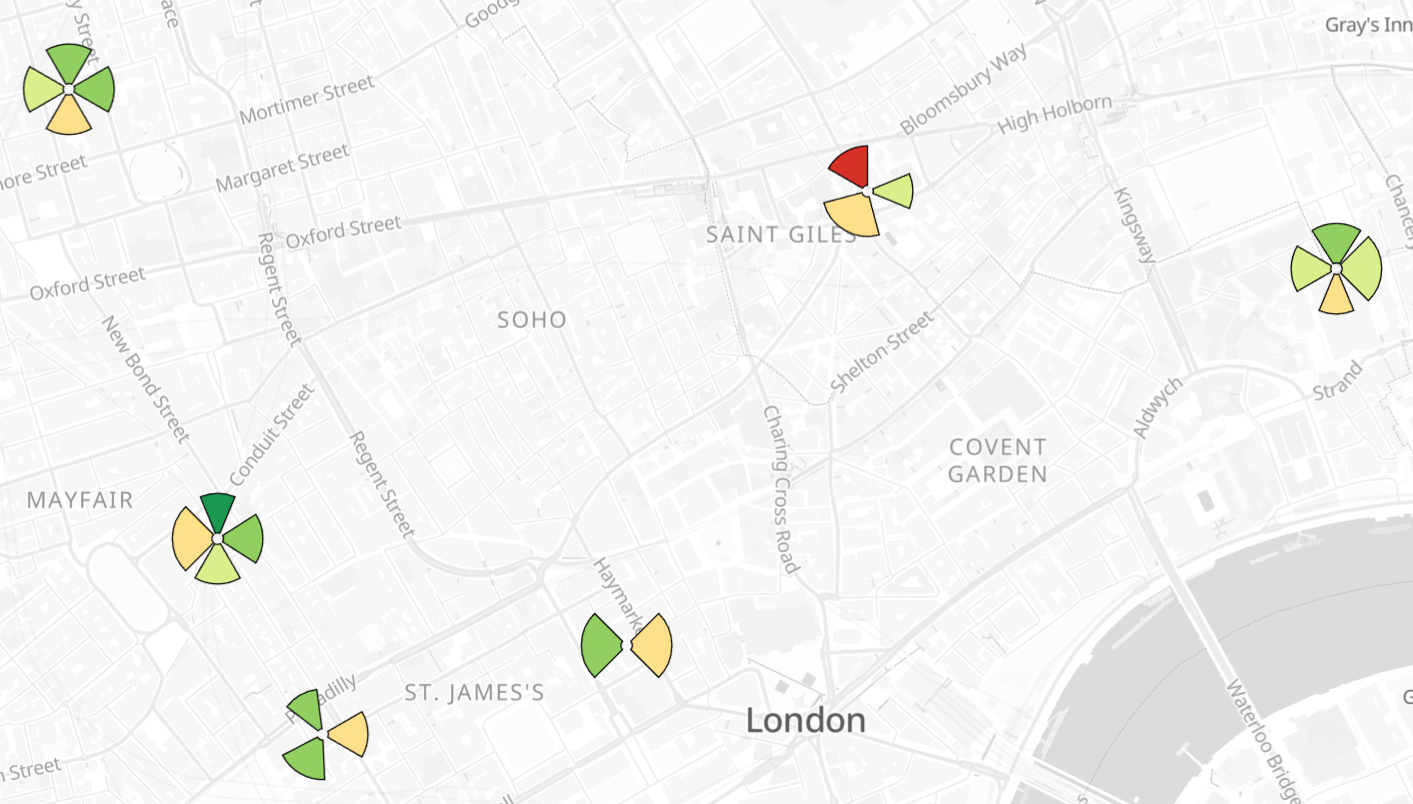
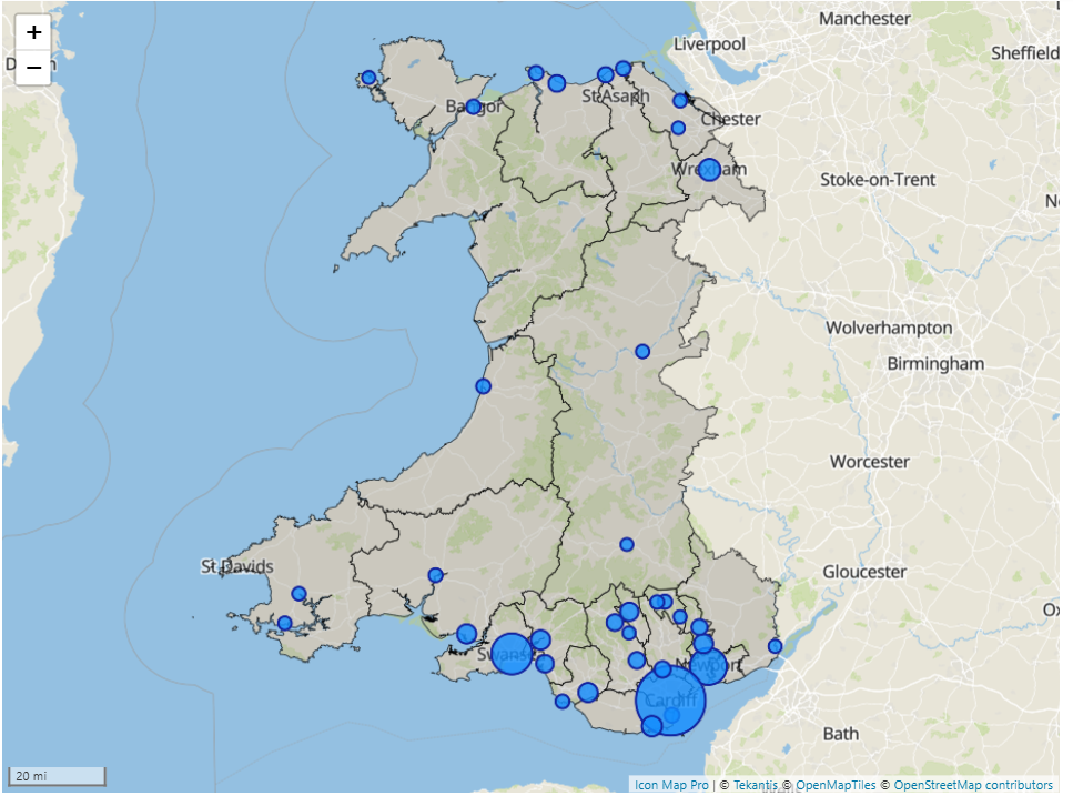
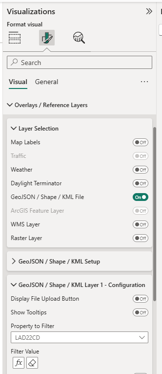
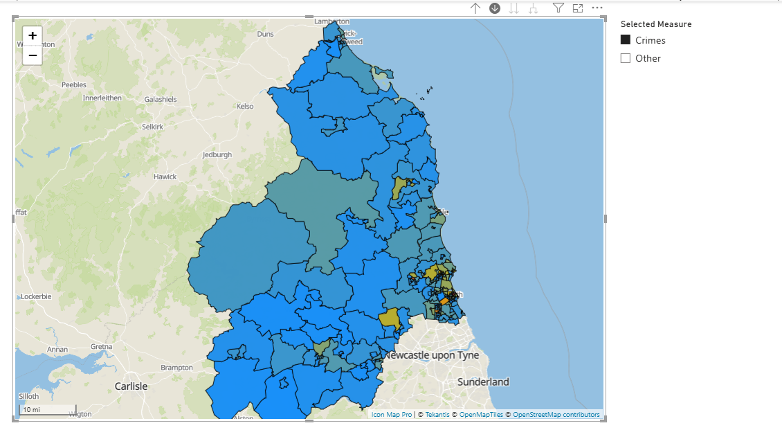
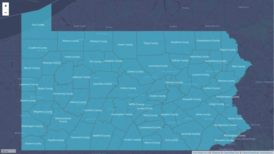
We now have all polgons with a WKT string under the 30K limits, so we can easily visualise it in Icon Map Pro
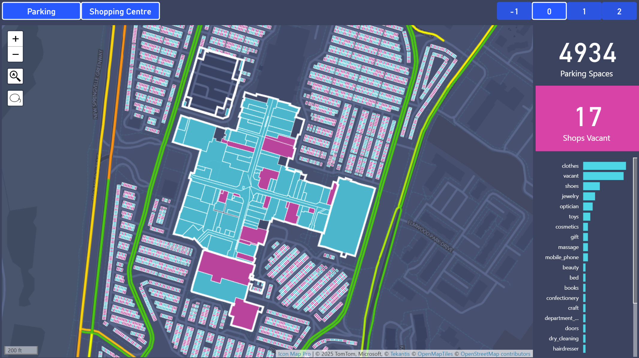
Pushing the Limits: Querying 1.65 Million Buildings in NYC
Encouraged by initial success, we challenged DuckDB further using the significantly larger buildings dataset. Previously, querying these datasets using Apache Spark in Databricks resulted in poor performance. DuckDB, however, excelled even on our local laptop.
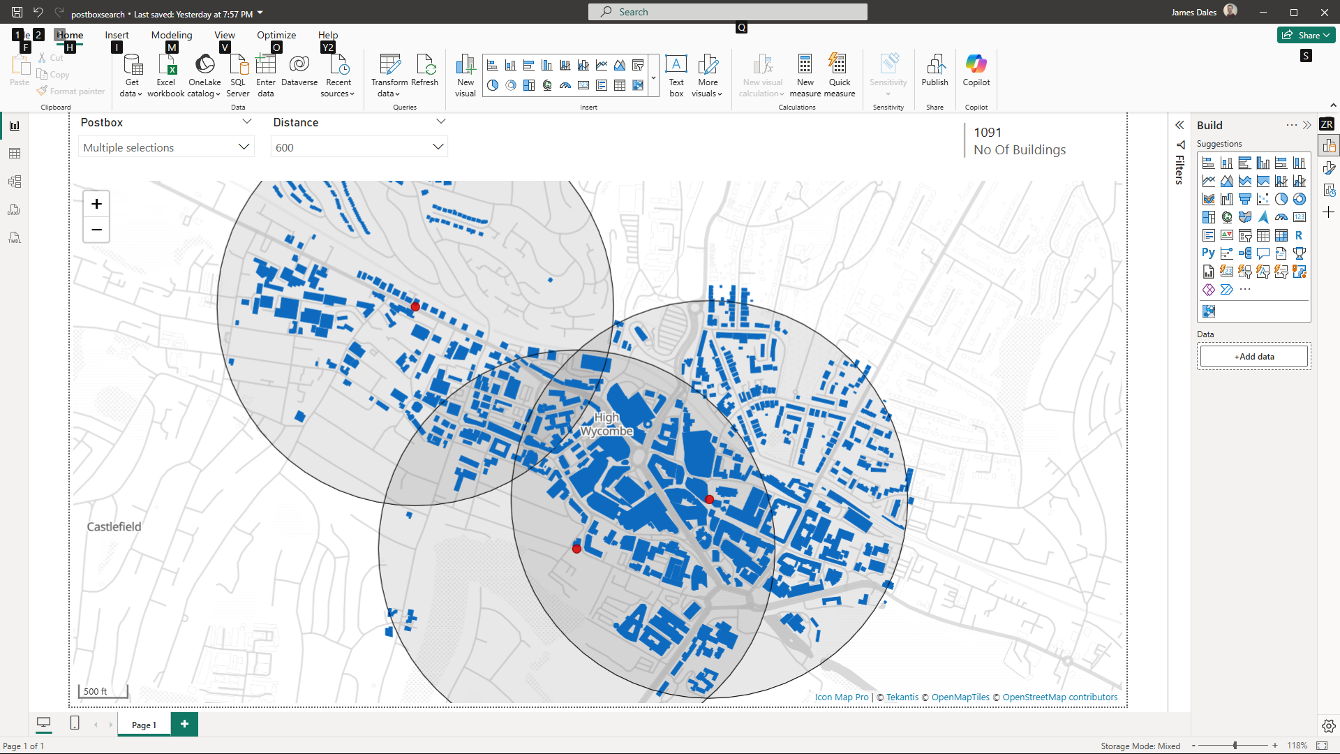
Now, we wanted to efficiently query buildings within a specific area, and the most effective way to do this is by using a bounding box. A bounding box defines a rectangular region with minimum and maximum coordinates, providing a quick way to filter geographic data. Ideally, we wanted to avoid manually calculating these coordinates. We noticed during our earlier exploration of the Overture divisions theme that each area already included a bbox column containing these coordinates. This gave us the idea to leverage these existing bounding boxes to easily geocode a city or area name. Once we had the bounding box, we could efficiently retrieve all buildings within that region by simply filtering based on these numeric values, eliminating the need for complex spatial queries.
The following is a Power Query function we created to easily retrieve a bounding box based on a city or area name and its standard 2-character ISO country code:
//////////////////////////////////////////////////////////////////////
//  GetCityBBox – returns "lat1,lon1,lat2,lon2" for a settlement    //
//////////////////////////////////////////////////////////////////////
let
    GetCityBBox =
        (
            cityName   as text,          // e.g. "London"
            isoCountry as text,          // ISO-3166 alpha-2, e.g. "GB"
            optional s3Region as nullable text
        ) as text =>
        let
            // ── query the locality polygon -----------------------------
            rows =
                OvertureQuery(
                    "divisions",
                    "division_area",
                    "bbox.xmin, bbox.ymin, bbox.xmax, bbox.ymax",
                    false,                                            // no geometry_wkt
                    "subtype = 'locality' and " &
                    "country = '" & isoCountry & "' and " &
                    "names.primary ILIKE '" & cityName & "%'",
                    null,                                             // no extra bounding box
                    s3Region,                                         // defaults to us-west-2
                    0                                                 // no simplification
                ),

            // ── pick the first match (refine filter if ambiguous) -----
            firstRow =
                if Table.IsEmpty(rows)
                then error "City not found in divisions data"
                else Table.First(rows),

            // ── assemble lat/lon string -------------------------------
            bboxTxt =
                Number.ToText(firstRow[bbox.ymin]) & "," &
                Number.ToText(firstRow[bbox.xmin]) & "," &
                Number.ToText(firstRow[bbox.ymax]) & "," &
                Number.ToText(firstRow[bbox.xmax])
        in
            bboxTxt
in
    GetCityBBox
Filtering with Bounding Boxes
We then modified our primary query function to include bounding box filtering capability:
//////////////////////////////////////////////////////////////////////
//  OvertureQuery – with optional bounding box                   //
//////////////////////////////////////////////////////////////////////
let
    OvertureQuery =
        (
            theme               as text,
            ctype               as text,
            optional columnsTxt       as nullable text,
            optional includeGeomWkt   as nullable logical,
            optional whereTxt         as nullable text,
            optional boundingBoxTxt   as nullable text,   // lat1,lon1,lat2,lon2
            optional s3Region         as nullable text,
            optional simplifyTolDeg   as nullable number  // tolerance in degrees, 0 ⇒ none
        ) as table =>
        let
            // ── defaults ────────────────────────────────────────────────
            region         = if s3Region        = null then "us-west-2" else s3Region,
            colsRaw        = if columnsTxt      = null or columnsTxt = "" then "*" else columnsTxt,
            addWkt         = if includeGeomWkt  = null then true else includeGeomWkt,
            tolDegDefault  = 0.0005,                    // ≈ 55 m at the equator
            tolDeg         = if simplifyTolDeg = null then tolDegDefault else simplifyTolDeg,

            // ── geometry expression ────────────────────────────────────
            geomExpr       = if tolDeg > 0
                             then "ST_SimplifyPreserveTopology(geometry, " &
                                  Number.ToText(tolDeg, "0.############") & ")"
                             else "geometry",

            // ── SELECT list ────────────────────────────────────────────
            selectList     = if addWkt
                             then Text.Combine(
                                      { colsRaw,
                                        "CAST(ST_AsText(" & geomExpr & ") AS VARCHAR(30000)) AS geometry_wkt" },
                                      ", ")
                             else colsRaw,

            // ── optional bounding-box condition ───────────────────────
            bboxCondRaw    =
                if boundingBoxTxt = null or Text.Trim(boundingBoxTxt) = "" then ""
                else
                    let
                        nums      = List.Transform(
                                        Text.Split(boundingBoxTxt, ","),
                                        each Number.From(Text.Trim(_))),
                        _check    = if List.Count(nums) <> 4
                                    then error "Bounding box must have four numeric values"
                                    else null,
                        lat1      = nums{0},
                        lon1      = nums{1},
                        lat2      = nums{2},
                        lon2      = nums{3},
                        minLat    = if lat1 < lat2 then lat1 else lat2,
                        maxLat    = if lat1 > lat2 then lat1 else lat2,
                        minLon    = if lon1 < lon2 then lon1 else lon2,
                        maxLon    = if lon1 > lon2 then lon1 else lon2
                    in
                        "bbox.xmin >= " & Number.ToText(minLon, "0.######") &
                        " AND bbox.xmax <= " & Number.ToText(maxLon, "0.######") &
                        " AND bbox.ymin >= " & Number.ToText(minLat, "0.######") &
                        " AND bbox.ymax <= " & Number.ToText(maxLat, "0.######"),

            // ── combine WHERE pieces ───────────────────────────────────
            whereTxtTrim   = if whereTxt = null then "" else Text.Trim(whereTxt),
            wherePieces    = List.Select({ whereTxtTrim, bboxCondRaw }, each _ <> ""),
            whereClause    = if List.Count(wherePieces) = 0
                             then ""
                             else "WHERE " & Text.Combine(wherePieces, " AND "),

            // ── parquet URL ─────────────────────────────────────────────
            parquetUrl     =
                "s3://overturemaps-" & region & "/" &
                "release/2025-01-22.0/" &
                "theme=" & theme & "/type=" & ctype & "/*",

            // ── ODBC connection string (in-memory DuckDB) ──────────────
            ConnStr =
                "Driver=DuckDB Driver;" &
                "Database=:memory:;" &
                "access_mode=read_write;" &
                "custom_user_agent=PowerBI;",

            // ── SQL batch ───────────────────────────────────────────────
            SqlBatch = Text.Combine(
                {
                    "INSTALL spatial;",
                    "INSTALL httpfs;",
                    "LOAD spatial;",
                    "LOAD httpfs;",
                    "SET autoinstall_known_extensions = 1;",
                    "SET autoload_known_extensions   = 1;",
                    "SET s3_region = '" & region & "';",
                    "",
                    "SELECT " & selectList,
                    "FROM   read_parquet('" & parquetUrl & "', hive_partitioning = 1)",
                    whereClause & ";"
                },
                "#(lf)"
            ),

            // ── run and return ──────────────────────────────────────────
            OutTable = Odbc.Query(ConnStr, SqlBatch)
        in
            OutTable
in
    OvertureQuery
Now we were ready to query the building outlines, along with a bunch of additional attributes that might be useful for further analysis. So let’s pull it all together and really put it to the test by attempting to extract all the buildings in New York City. We used our bounding box function to locate the spatial extent of the city, then passed this to our main query function.
let
    NewYorkBBox      = GetCityBBox("City Of New York", "US"),
    NewYorkBuildings =
        OvertureQuery(
            "buildings",
            "building",
            "id, names.primary, class, height, subtype, class, num_floors, is_underground, facade_color, facade_material, roof_material, roof_shape, roof_color, roof_height",
            true,
            null,
            NewYorkBBox,
            null,
            null
        )
in
    NewYorkBuildings
Amazingly, within around 5 minutes, we had extracted all 1.65 million buildings in New York City, complete with building outlines and a wealth of rich attributes. Even more impressive was that Power BI's resource usage remained minimal.
Spatial Joins: Assigning Buildings to Neighbourhoods
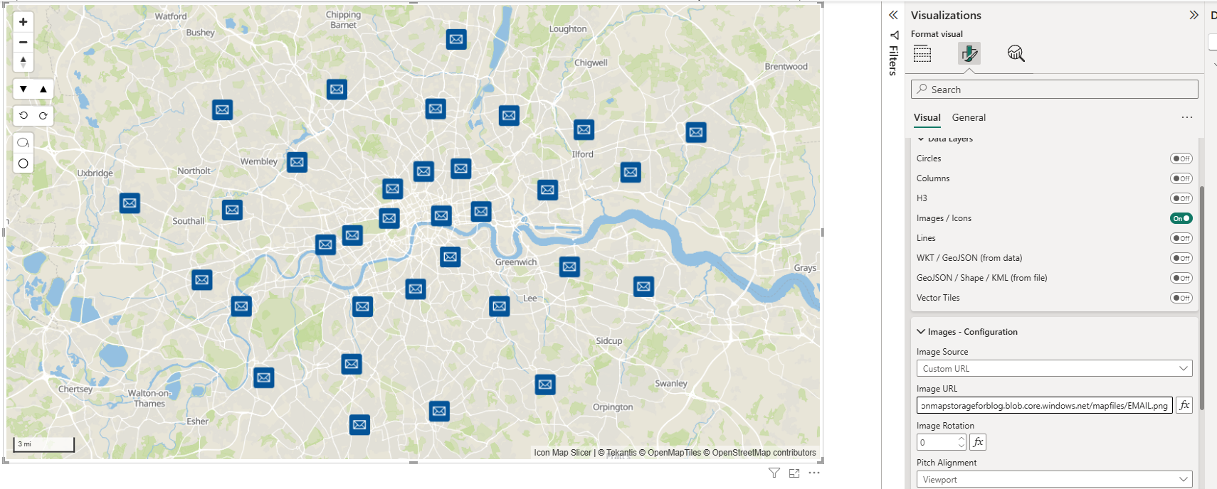
That is pretty cool, but even though Icon Map Pro can display up to half a million polygons on a map, 1.65 million buildings is just too many to visualise effectively. To manage this, we needed a way to filter buildings by area. Unfortunately, the Overture data does not provide a direct foreign key between buildings and divisions such as neighbourhoods, so we needed to perform a spatial join. No problem, however, because we can do exactly that using DuckDB's spatial functions.
This required switching back to SQL, as the query is more complex. We first selected the New York neighbourhoods from the division_area layer, then retrieved all the buildings within the city’s bounding box, and finally performed a spatial join using ST_Intersects to associate each building with its corresponding area.
let
    Source = #"DuckDB Overture SQL Script"("
    -- 1.  Pull the New York City divisions you care about
WITH areas AS (
    SELECT
        id                    AS area_id,
        names.primary         AS area_name,
        subtype,
        geometry              AS geom
    FROM read_parquet(
             's3://overturemaps-us-west-2/release/2025-01-22.0/theme=divisions/type=division_area/*',
             hive_partitioning = 1
         )
    WHERE country = 'US'
      AND region  = 'US-NY'
      AND subtype IN ('neighborhood')
),

-- 2.  Load buildings inside the city’s overall bounding box first
bldg AS (
    SELECT
        id              AS building_id,
        names.primary   AS building_name,
        class,
        height,
        subtype,
        class,
        num_floors,
        is_underground,
        facade_color,
        facade_material,
        roof_material,
        roof_shape,
        roof_color,
        roof_height,
        geometry AS geom
    FROM read_parquet(
             's3://overturemaps-us-west-2/release/2025-01-22.0/theme=buildings/type=building/*',
             hive_partitioning = 1
         )
    WHERE bbox.xmin > -74.3 AND bbox.xmax < -73.5
      AND bbox.ymin >  40.4 AND bbox.ymax <  41.0
)

-- 3.  Spatial join: which building sits in which area?
SELECT
    a.area_name,
    a.subtype,
    b.building_id,
    b.building_name,
    b.class,
    b.height,
    b.subtype,
    b.class,
    b.num_floors,
    b.is_underground,
    b.facade_color,
    b.facade_material,
    b.roof_material,
    b.roof_shape,
    b.roof_color,
    b.roof_height,
    ST_AsText(b.geom) AS geometry_wkt
FROM bldg b
JOIN areas a
  ON ST_Intersects(a.geom, b.geom);
    ", null),
    #"Filtered Rows" = Table.SelectRows(Source, each true)
in
    #"Filtered Rows"
Incredibly, we managed to join all 1.65 million rows in memory within Power BI on a standard laptop. Even more impressive, when monitoring system performance, Power BI Desktop was only using about 10% of CPU and under 4GB of memory, barely 1GB more than its normal baseline usage. Definitely some voodoo magic going on somewhere!
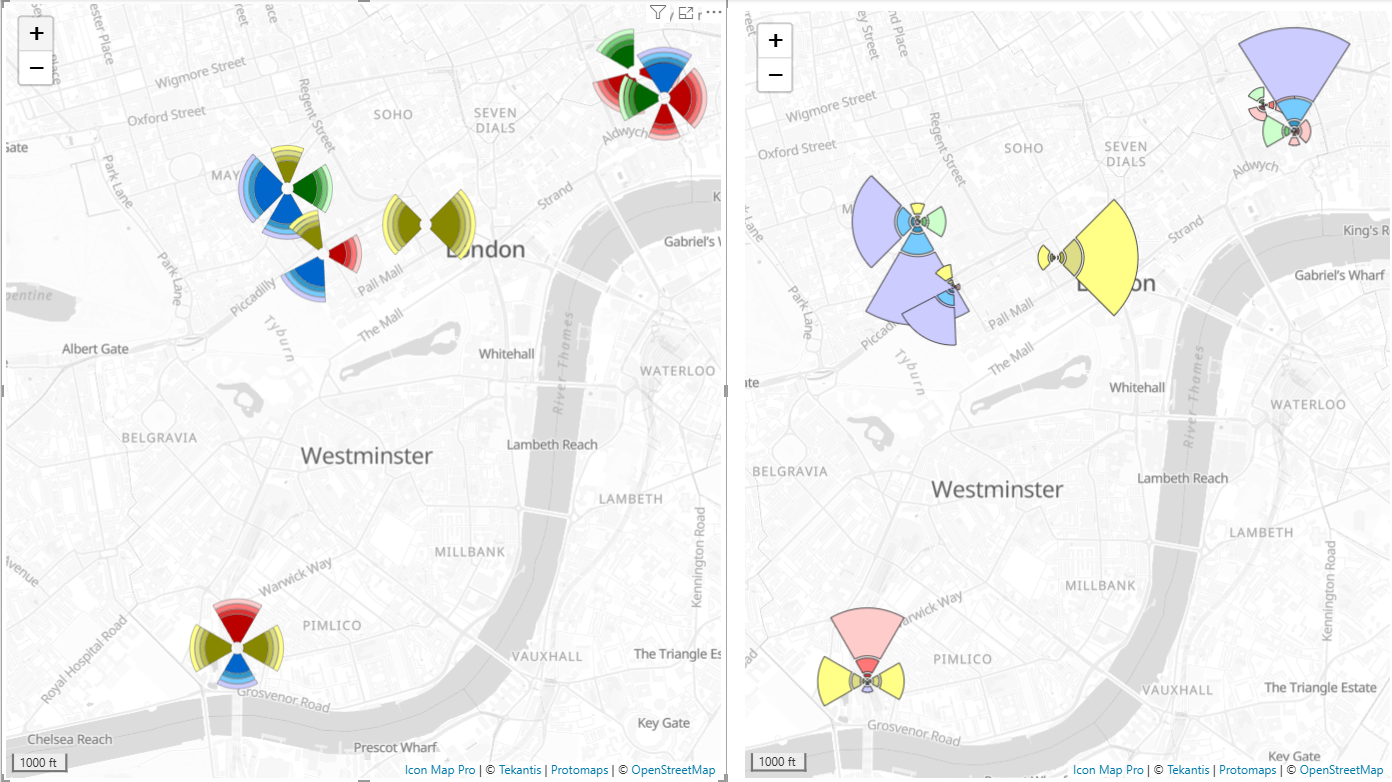
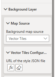
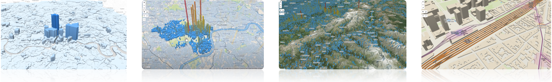
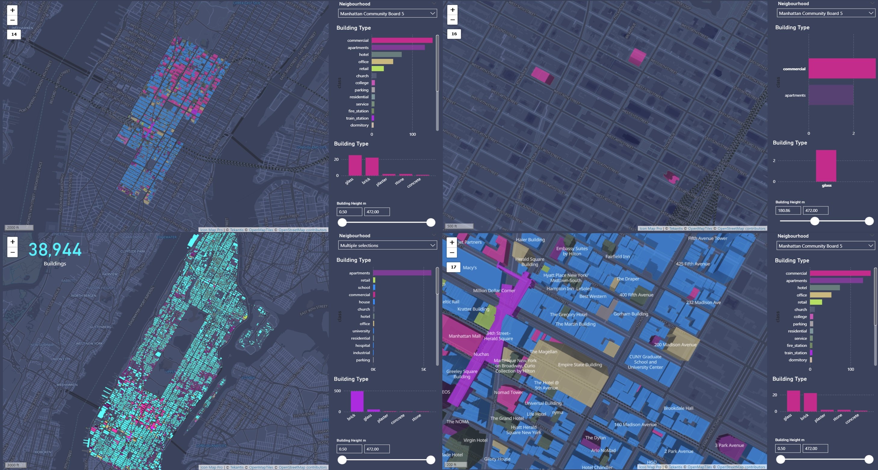
Visualising Results in Icon Map Pro
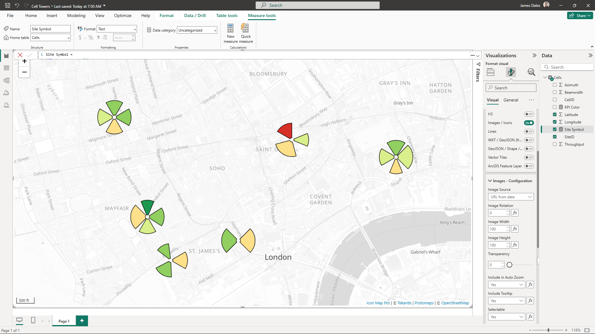
Finally, we visualised the results using Icon Map Pro within Power BI, colouring the buildings by type, and cross-filtering buildings by neighbourhood, type, height, and material properties.
So, What's the Catch?
Currently, the only limitation is that DuckDB's ODBC driver isn't included by default in Power BI Service. Hence, similar to other third-party ODBC drivers, a Power BI Gateway server is required. Thankfully, setting this up is straightforward, simply spin up an Azure VM, install the DuckDB driver, and configure it as your gateway. You’ll then fully leverage DuckDB's capabilities in your Power BI cloud environment and be able to refresh on a schedule like any other data.
Explore the Possibilities
We encourage you to explore and innovate with this approach, leveraging Overture Maps or your own spatial datasets. Experiment freely and share your exciting findings with us!
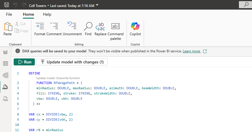
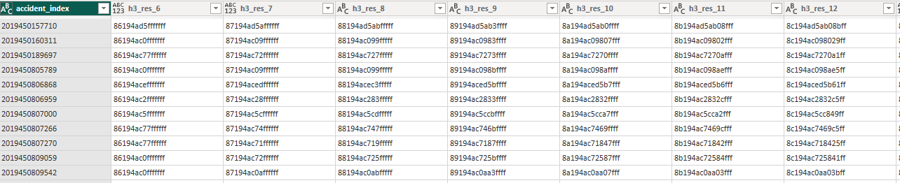
You can download a copy of the PBIX file here which includes all the powerquery functions and some other goodies like using DuckDB for generating H3 hexagons, another blog post coming soon on that one!